Why Smart Website Design Solutions Go Beyond Looks
Every business owner I have worked with starts the same way. They want a site that looks beautiful. And I get it. First impressions matter. But after a decade of building and optimising sites, I have learned that beauty alone never pays the bills. What actually drives results is a combination of thoughtful structure, performance under the hood, and a clear understanding of who visits your site and why.
I once consulted for a boutique retailer who had spent six months perfecting a visual masterpiece on Wix. The site was stunning. But nobody bought anything. The problem had nothing to do with colour palettes or fonts. It was a lack of user experience thinking. The call to action was buried below a hero image that took six seconds to load. On mobile, the text overlapped. That retailer needed more than a redesign. They needed a complete rethinking of how their website design solutions addressed real visitor behaviour.
What Makes a Website Actually Work
When I talk about website design solutions, I am not talking about templates or themes. I am talking about a system where every element has a job. The layout guides the eye. The copy answers a question. The load time respects the visitor's patience. And the whole thing adapts seamlessly to whatever device someone happens to be using.
Responsive design is the floor, not the ceiling. We passed the point where having a mobile-friendly site was optional years ago. Now it is about mobile-first thinking. That means designing for the smallest screen first and scaling up, not the other way around. Google Analytics data from my own projects shows that over sixty percent of traffic comes from phones. If your site treats mobile as an afterthought, you are losing visitors before they ever see your content.
Performance and Trust Signals
Page speed is one of those things that gets mentioned in every blog post but rarely gets fixed in practice. I have measured sites that take eight seconds to load a single page. That is an eternity. Users expect a page to appear in under three seconds. Every second beyond that increases bounce rates by about thirty percent. And it is not just user patience that suffers. Google uses page speed as a ranking factor. A slow site hurts your SEO.
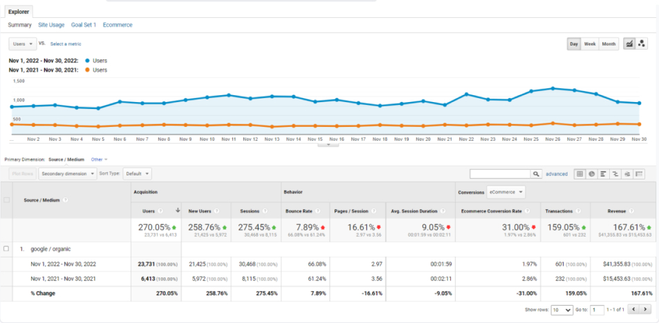
Another trust signal that many people overlook is the SSL certificate. If your site does not run on HTTPS, modern browsers will flag it as insecure. That kills credibility instantly. A hosting provider that offers free SSL and solid uptime is worth paying for. Cheap hosting might save you twenty dollars a month, but it costs you in lost conversions and poor page speed.
Choosing the Right Tools for the Job
I have built sites on almost every platform you can name. Each one has strengths and weaknesses. WordPress remains the most flexible content management system out there. It gives you complete control over SEO, user experience, and functionality. But it also requires maintenance. You need to update plugins, manage security, and keep an eye on performance. For clients who want a simple online store, Shopify is often a better fit. It handles checkout, inventory, and payment processing out of the box. You trade some customisation for convenience.
Wix is fine for a personal site or a very small business that does not plan to scale. But I have seen too many companies outgrow Wix within a year. They end up migrating to something more powerful, and that migration is expensive and disruptive. My advice is to think about where you want to be in three years, not just what is easiest today.
When it comes to designing the actual layout, tools like Adobe XD and Figma have changed how teams collaborate. I use Figma for wireframes and prototypes because it lets clients click through a mockup before we write a single line of code. That saves a lot of rework. But a prototype is not a finished site. The real test comes when you put a landing page in front of real users and watch what they do.
Measuring What Matters
This is where analytics and visitor tracking come into play. I install Google Analytics on every site I build. But I also use heatmap tools to see where people actually click. I once worked on a site where the team had spent weeks perfecting a hero section with a large banner and a call to action button at the bottom right. The heatmap showed that almost nobody looked at the bottom right. They were all clicking on a small image in the upper left that was not even linked to anything. We moved the call to action next to that image and conversions went up by forty percent.
A/B testing is another method that separates guesswork from real improvement. You can test headlines, button colours, form lengths, and images. The key is to test one variable at a time and let the data run long enough to be statistically significant. I have seen people run an A/B test for two hours and declare a winner. That is not testing. That is noise.

Conversion Rate Optimisation in Practice
Conversion rate optimisation is not a one-time project. It is a continuous cycle of hypothesising, testing, learning, and iterating. One of the simplest wins I have found is reducing the number of form fields on a landing page. Every extra field costs you a percentage of completions. If you do not need someone's phone number to send them a quote, do not ask for it.
Another low-effort change that works consistently is making the call to action text specific. Instead of "Submit" or "Click Here", try "Get Your Free Quote" or "Start Your 30-Day Trial". It tells the user exactly what they will get. That clarity reduces hesitation.
Content Management and Long-Term Maintenance
A content management system is only as good as the team that uses it. I have seen beautifully built WordPress sites fall apart because nobody knew how to add a blog post without breaking the layout. That is why I always include a short training session when I hand over a site. Show someone how to update text, add images, and publish a page. It saves everyone time later.
I also recommend setting up a regular maintenance schedule. Security updates, plugin updates, and database backups should happen automatically. A good hosting provider will handle some of this, but you still need someone to monitor uptime and performance. I have had clients whose sites went down for three days because they did not realise their hosting plan did not include support. That is a hard lesson to learn.
The Human Side of Design
At the end of the day, website design solutions are about people. The people who visit your site have problems they want solved. They have limited time and unlimited distractions. Your job is to make their path as smooth as possible. That means clear navigation, fast load times, and content that answers their questions before they have to ask.
I remember a project for a small consultancy that sold high-ticket services. Their original site had a lot of industry jargon and a very formal tone. We rewrote the copy to speak directly to the client's pain points. We added case studies instead of feature lists. We changed the call to action from "Contact Us" to "Book a Free Strategy Call". The result was a sixty percent increase in qualified leads within three months. That is what happens when you align your site with how real people think and decide.

Good design is invisible. When someone visits your site and finds exactly what they need without thinking about it, that is the goal. It takes effort, testing, and a willingness to change things that feel comfortable but do not perform. But the payoff is worth it.
If you are planning a new site or rethinking an existing one, start with honest questions. Who is your audience? What do they need? What is stopping them from taking the next step? Let those answers guide your choices around platform, layout, and content. Everything else is just decoration.